Print brief research and planning
Research and planning blog tasks
Create a blogpost called 'Print brief research and planning' and complete the following tasks to plan and prepare your print work:
1) Find at least five music magazine front covers (either current or former magazines as many have stopped their print editions) aimed at a similar target audience to your project (mainstream music audience) and research music magazine key conventions. For each one, pick out one design idea, convention or image/text style that you could use in your own print work. A few examples to start you off:

One feature from NME I would like to use it the celebrity or the artist featuring in the centre grabbing the attention of the audience, celebrity Features, magazines often feature well-acknowledged artists and celebrities for example Kendrick Lamar fruiting in the NME magazine. This is for the main stream audience that wants to know more about their favourite celebrities or artists.
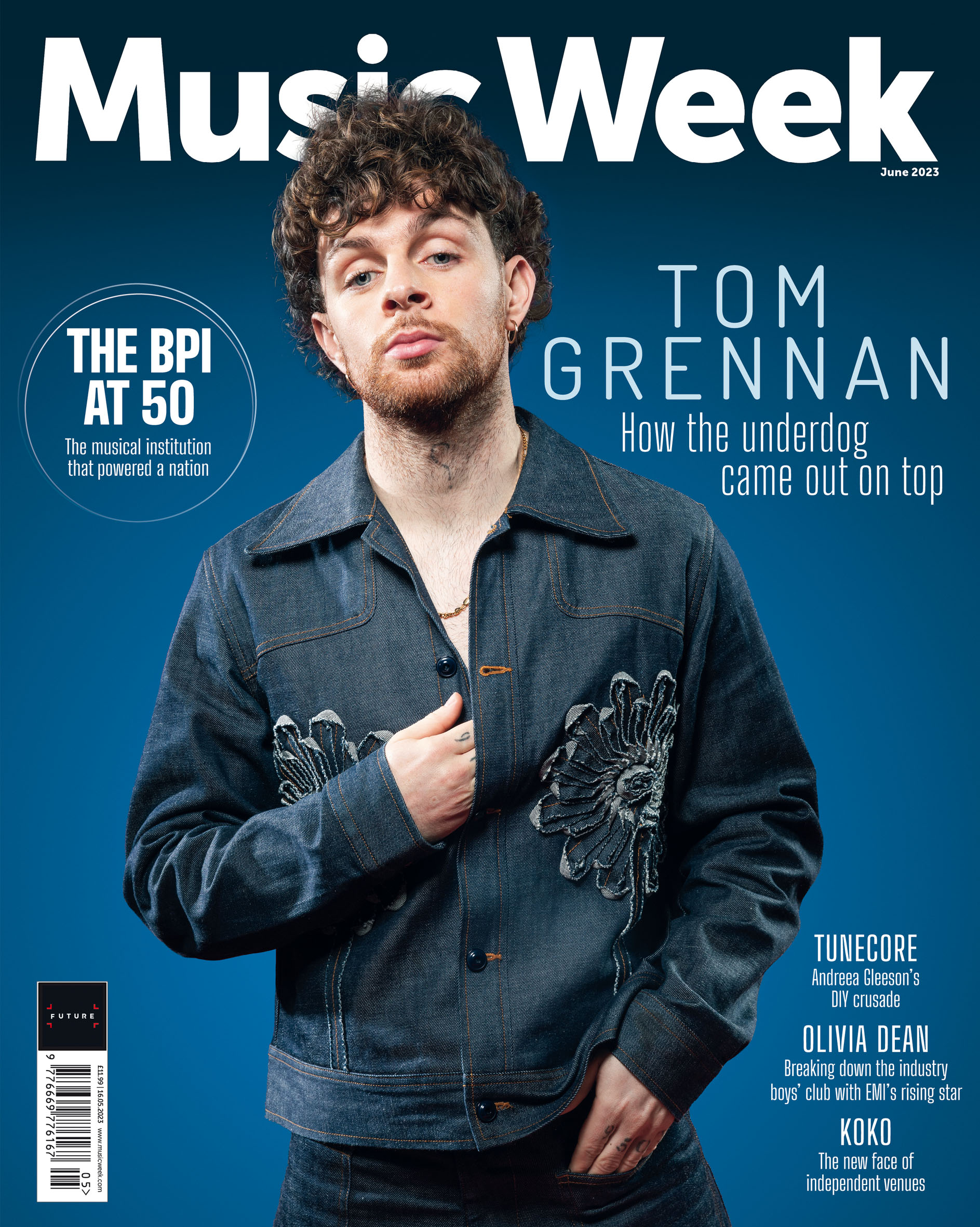


One key convention I would like to take from this magazine is its eye-catching Imagery of the artist Niki Minaj, the most important aspect of a double-page spread is the imagery. High-quality, often full-page photographs of artists, events, or album artwork are used to grab attention. The photo may span both pages, creating a seamless image, or it may be designed with parts of the image on one page and the rest on the other, Like how the artists arm is on both the pages.

One key convention I would like to take from this magazine is the headline Placement and sub-headlines. they are placed above Taylor Swifts head as it's placed to not interfere with the image, but support it. Many times the headline is across both pagesfor balance and weight. The main headline is usually bold and/or larger and distinctive. Sub-headlines, captions, or quotes are smaller like at the bottom on the second page.

One key convention I would like to implant into my magazine is the White Space is a key element to the design of a double-page spread. This prevents the pages from becoming too crowded with too much text or too many images to balance out the design so that it is not overwhelming. The space provides contrast to make the visuals pop much more and allows the spread to be read and viewed much easier.
- Column layouts for text, designing features for an interview, the usual treatment is to set text in columns. These break up hefty blocks of text and make the feature more readable. text is set to align with the outer edges of the pages, setting the main visual more to the centre like so on this double page feature.


- They are deigned using images and Visuals. Images help make the contents page attractive. They give a hint about the articles and attract a readers' attention. There are small images for every article or feature on the contents page. For example, a photo of a featured artist can be put alongside the listing of the interview with that artist.
- Columns and Sections, the features page consists of columns such as "Features," "Interviews," "Reviews". Each column dealing with a particular section or category of content. The idea is to present clear access to the page, with each section headed and organised, making it more efficient for the audiences.
- Contrasting Colours:,magazines use colour schemes to make different sections stand out or make certain articles pop. The section for "Interviews" could be one colour, while "Album Reviews" is an other. This helps guide the reader.


- Artist Photo, the point of a tour poster is very clear, striking photo of the artist, visual pertinent to the artists' music. It's bigger than any other text on the poster, always taking centre. A live performance picture from past tours
- Live Shots, live performance images are often used on the posters. These convey energy, excitement, and the thrill of a concert. Pictures of the artist on stage, with lights, smoke, or crowds in the background, the feeling of attending the concert.
- Tour name and artist name, the tour name is the largest, boldest, most catching font, the artist/band name
- Font Style and Personality: the images and theme should mirror the artist style or genre they performs under
Capacity: 300
for my R&B artist, The Jazz Café in Camden really fits . It is much smaller,more intimate, with a keen focus on the quality of the sound and maintaining a very chilled. It has an intimaterelationship with the audience because of proximity to each other, ideal for smooth, sultry R&B where the artist should feel pretty much at one with the audience.
it is recognised for its great historic vibe, this venue combines both intimacy and scale, fitting my R&B artist trying to engage a crowd at deep emotional levels.
Capacity: 4,921; options include standing and seated, so larger crowd without losing the intimate feel.
1) Who do you need to photograph for your front cover and inside page images? Remember, you need seven original images across the whole print production.
- For the front cover it will be of my artist and there will be smaller pictures related to the cover picture.
- The rest of the 4 pictures will be for the mainstream audience.
- I will have pictures of nature and music related images.
- main cover: close up shot of my artist.
- far shot of my second actor in the centre.
- medium shot: nature and rnb related images.
3) Plan the mise-en-scene. What costume, props or make-up will you require for your photoshoots?
- My artist will be wearing dull colours and dark makeup, there will be no props at the back to represent the empty feeling she feels.
- Dark lighting.
- I plan on taking my photoshoot on the 10/02/25 during lesson time and after school. It will be inside school in a dark setting.

Comments
Post a Comment